When is a book not a book? The destruction of a book – through burning, through recycling, through iconoclasm, for instance – places great emphasis on its materiality, its power as a physical object that must be destroyed. Conversely, when nobody knows about a book’s existence, it simply disappears – both the physical book and the textual lives inside it. When a book is unknown and hidden away it is perhaps reduced to the bare facts of its existence: a piece of matter unread, unloved, unvalued, uncatalogued.
Books disappear easily when they are not catalogued; it is through catalogues and finding aids that medievalists find their sources. When I joined Birkbeck College as a lecturer in 2002, I was excited to find that the College owned one manuscript, which I knew about from Neil R. Ker’s magisterial four-volume catalogue, Medieval Manuscripts in British Libraries. But time passed, I became diverted by other projects, and I never got round to looking at the manuscript. And then I more or less forgot about it.
This year I have been teaching a class on ‘Medieval Material Texts’ for students on Birkbeck’s MA in Medieval Literature & Culture. It struck me that it would be so much easier to talk about medieval books if one had one to show to the students – to talk about the binding, the physical construction of a book, the stains and the damage, the signs of a book’s lived life, as well as the text, the decoration, the illustration. So, somewhere in the back of my mind, I remembered Ker’s description of one manuscript, and looked it up, and sent an email off to my subject-librarian at Birkbeck’s library.
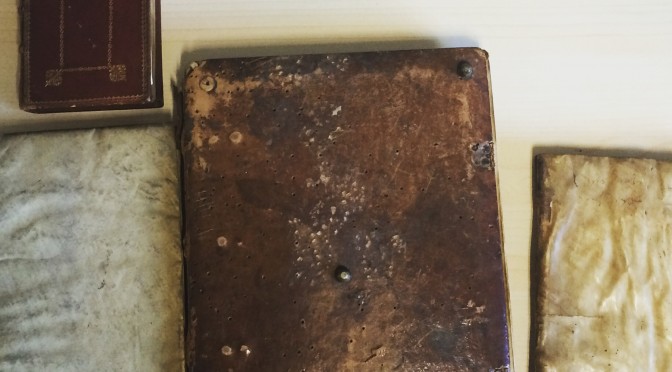
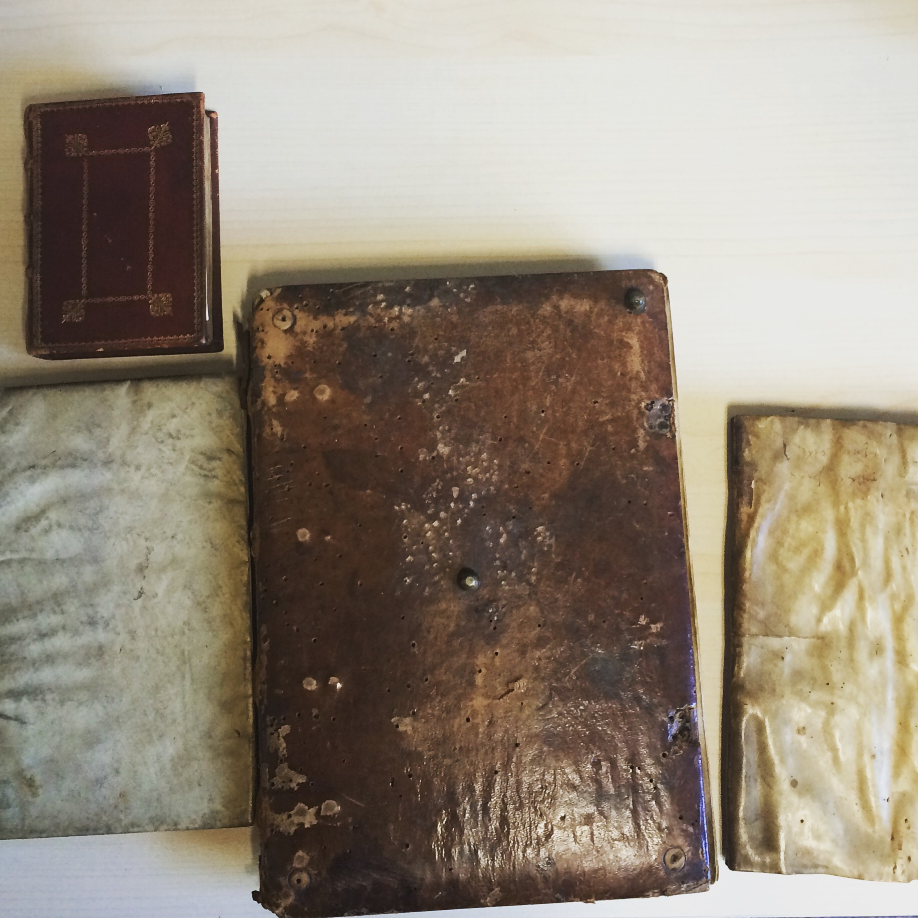
It was as much as a surprise to the College as it was to me to discover that Birkbeck houses a small collection of not one but four medieval books (three manuscripts and one incunabulum). I quickly arranged to view the books, three of which have not been catalogued and do not seem to have been viewed since around 1991. The books comprise a sort of ‘capsule collection’: they represent several important developments in European religious culture, in book history, and in literary tastes.
The books are:
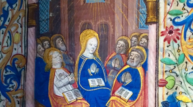
Birkbeck Hours; Pentecost (fol. 105r)
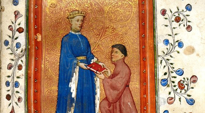
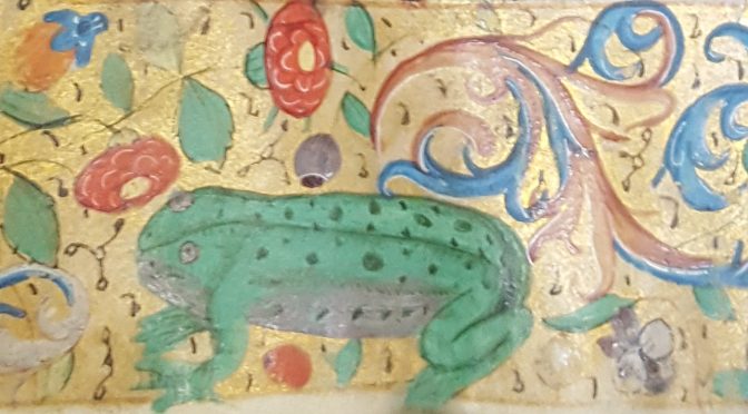
The Birkbeck Hours (sine numero): a beautiful small book of hours, from northern France, dated to c. 1400.
MS L.I: the rules and customs of the Capitoli della Compagnia di S. Girolamo of Siena, dated to the early fifteenth century.
MS 108.C: a manuscript of the Sententiae Sapientiae, attributed to Aristotle, Plato, Socrates, and Seneca, and which once belonged to the Monastery of St Zeno, Verona; dated to c. 1450.
Dictys Cretensis& Dares Phrygius (sine numero): a skin-bound volume, a much-read history of the Trojan War, printed at Venice, 1499.
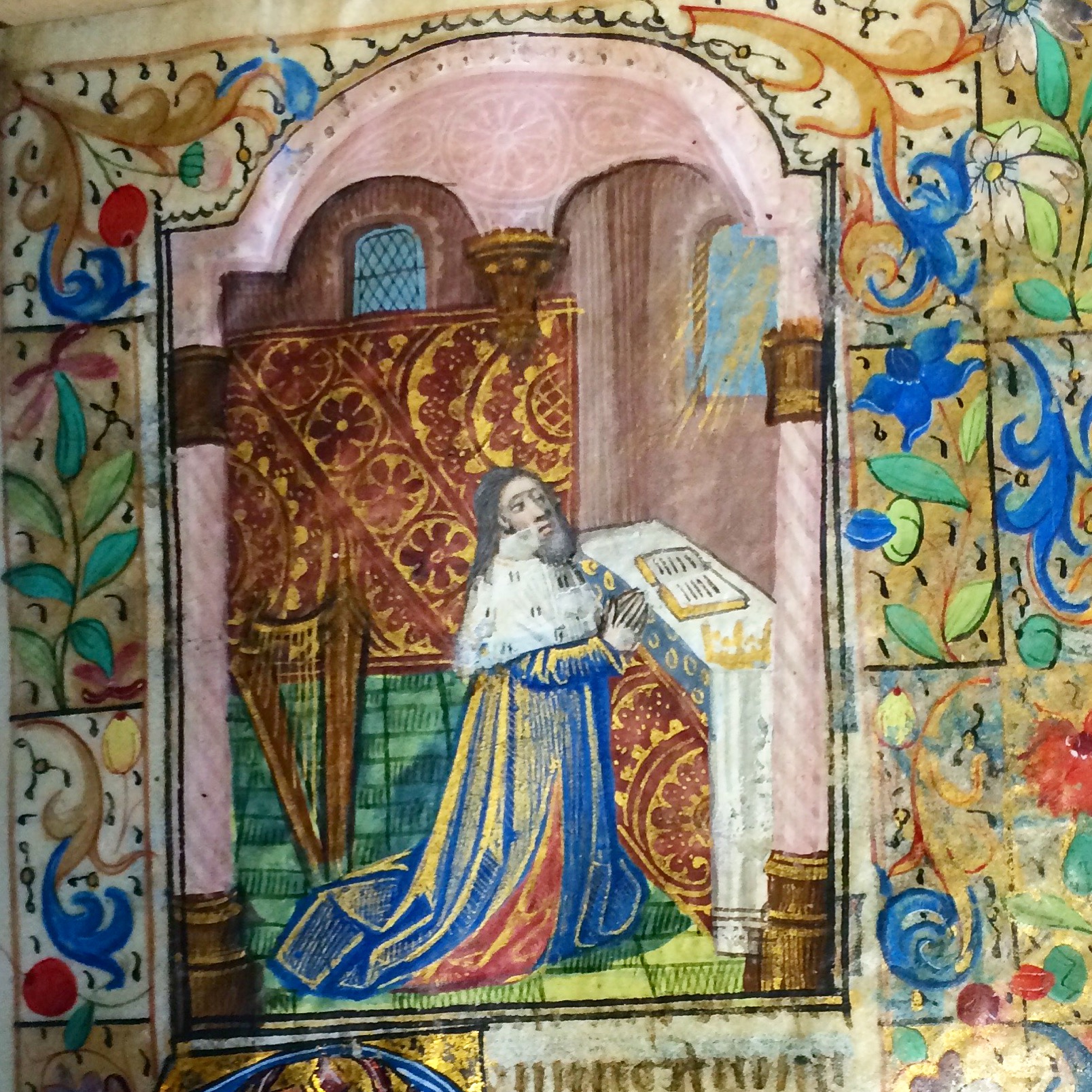
Birkbeck hours; King David at Prayer (fol. 85r)
One of the manuscripts, the Birkbeck Hours, was given to the College in 1977 by the widow of Dr Charles Fox (1897-1977), a lecturer at Birkbeck who later became a distinguished mathematician at Concordia University in Montreal. How the other three manuscripts reached Birkbeck is not known at present, although we do know that MS L.I was purchased by the College in the 1950s, probably to be used as a teaching aid. Ownership inscriptions in MS 108.C show that, in the nineteenth century, it belonged to a Peter John Bruff and, later, the Victorian scholar and antiquarian R. A. H. Bickford-Smith (1859-1916).
The books open a window onto readers and writers from hundreds of years ago; by coming back into public view, they can delight and instruct again. A more detailed examination of the books will, in time, yield much more about the lives these fascinating books have lived, and continue to live.
NB: The books are not currently available for public view, but it is hoped that a digitisation project will make them available online in due course.
Sluice is a radical four-day art event that questions the role of the contemporary art fair. Taking place during Frieze Week, Sluice acts as a refreshing counterbalance to the corporate manufactured glamour of the Frieze Art Fair. This year Sluice is located on the South Bank in London’s iconic Bargehouse building at Oxo Tower Wharf. Throughout the weekend there will be performances, screenings, talks and a collection of artist-run spaces and galleries exhibiting new and challenging work. Unlike Frieze, entry is free. Spiralbound will be at the Sluice Art Fair throughout, displaying our range of recently published books.
Spiralbound is a non-profit artists’ publishing project exploring the influence of new digital technologies on the material presence of the book. Strongly supported by London gallery studio1.1. and existing as an offshoot of Susak Press, we work with artists and writers who want to use the book medium to experiment beyond, and challenge their usual practice. By subverting the capabilities of digital print on demand, the project’s aim is to publish book editions that remain uncompleted and in flux as we allow our authors the opportunity to re-shape and interfere with the book’s original version. Spiralbound is investigating how new digital technologies influence the way in which we read literary texts and how new digital influence is encouraging experimentation with the materiality of the book.
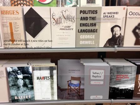
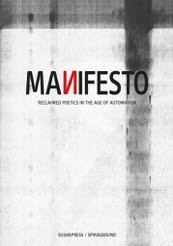
Spiralbound holds events throughout the year and at each event we launch new titles and also new editions of existing books. Our authors have the freedom to re-visit, edit and make a new edition of their book by adding or taking away image and text. As a result, the books Spiralbound produces reveal successive drafts and stages of an author’s work in progress. This allows the reader to collect and compare different versions of each book. By producing non-static content, Spiralbound is channeling performance and the immediacy of the live event into the book’s materiality whilst attempting to capture the flick and switch and pause and collect of internet-centered new digital media. For example in Manifesto (Daniel Devlin, John Hughes and Keran James), blurred images of unheralded literary and artistic figures of the twentieth and twenty-first century are uploaded and updated in each printing. These recycled and found images are juxtaposed with a collaborative group hacking and re-writing of an experimental text. Similarly, Skip I Am Far Above You (Keran James) unpacks and transforms internet spam into a piece of (in)coherent storytelling.
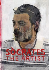
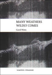
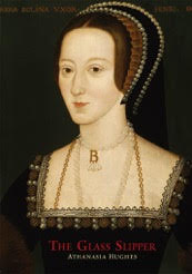
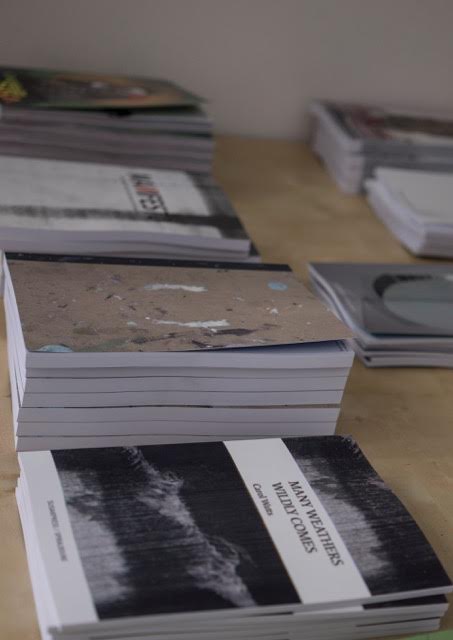
Books, like painting and sculpture, invite us to get our hands dirty unlike the clinical touch and trace of digital surfaces. The materiality of new digital technologies, from the click of a mouse, to the thin peel of a protective iPad cover, to the buzz of a mobile on vibrate, are making contemporary writers and artists more conscious of the physical aesthetic of the book form. What connects the Spiralbound books is an engagement with the boundaries between fiction and reality. Both Socrates (Daniel Devlin) and Manifesto of A Tranny (Brian Dawn Chakley) capture live performance by combining text and video stills but it is unclear if these grainy images are depicting events that were stage managed, accidents or if they even took place. Biographies (Ghazal Mosadeq) plays with the recording and fabrication of fictional authors’ real life stories. Many Weathers Wildly Comes (Carol Watts) captures the practicality of an everyday walk yet is recorded through the blurred snapshots of a London dreamscape. Lamping Out The Trains part 1 (The RMT Jubilee South Branch Audio and Film Collective) combines oral recollections with fragments of radical London literature addressing themes of nostalgia, trauma and left-wing melancholia through a manipulation of found audio, film and text. The Glass Slipper (Athanasia Hughes) is a futuristic satire on consumerism and fashion and our increasing dependency on technology, yet the story is told through a relationship with a hologram.
Computer software programmes and applications like Photoshop or Final Cut have appropriated the visual materials traditionally related to books through their use of cut and paste, scrolls, paper clips and page turning. Digital Media theorist Lev Manovich states that ‘many new media objects are converted from various forms of old media’ (Lev Manovich, The Language of New Media, 2001; p. 28). For example, a webpage can be read like a photograph album or an iPad application similar to a pack of playing cards (Manovich, p. 220). At the same time, archived text messages and emails cease to be emails. Rather they take on the form of a photograph, becoming a screen shot frame that has fleetingly captured a moment of a past life. This peculiar digital aesthetic is the essence of Spiralbound. Taking something fluid and in motion, freezing it, observing and considering it, watching it but allowing it to develop and evolve. As a result each book acts as a snapshot of live text, a fleeting moment in our spiral bound times.
Spiralbound books, therefore, exist in an in–between world. The books are produced and bound professionally yet they are determinedly not part of commercial publishing. These books cannot be found in bookshops. In a way they don’t really exist, as they have no ISBNS. Yet neither are they Artist Books. There may not be many copies but they are not limited editions. Print on demand allows easy access and production, and all Spiralbound books are sold at £5. They are not zines or pamphlets but borrow the DIY spirit of Punk. Just as Sluice is re-positioning and challenging the contemporary art fair, so Spiralbound, by responding to the influence of new digital technologies, is helping to re-position the Artist Book.
Spiralbound will be at Sluice Art Fair 16 – 18 October 2015
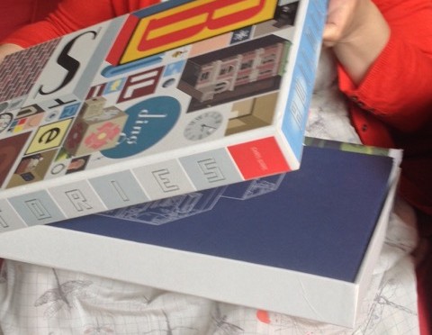
Chris Ware, Building Stories (London: Jonathan Cape, 2012). A piece of work produced as part of The Book Unbound module at Birkbeck run by Dr Luisa Calé.
Chris Ware’s Building Stories (2012) is a graphic novel presented and sold in a box. Following in the footsteps of Marc Saporta’s Composition No.1 (1961), B.S Johnson’s The Unfortunates (1969) and Julio Cortazar’s Hopscotch (1966) Ware’s Building Stories is an example of a contemporary novel that subverts the materiality of the book. The box is 42cm in length x 29cm wide x 4.5cm deep and has the appearance of a board game. Martha Kuhlman has suggested that the design of the box creates a parallel with French avant-garde comics group ‘Oubapo’ which means ‘workshop of potential comics’; she writes, ‘[f]or Ware and the French cartoonists, comics become a kind of game in which one can manipulate and test the limits of the medium’ (The Comics Journal, 8th October 2014). In Ware’s Building Stories the game we are being asked to play concerns the anxiety of story making itself. It demands the reader’s participation, forcing us to build the stories physically. Visually it re-creates childhood memories of playing board games yet this is a game we play on our own. On the base of the box a diagram instructs the reader to open the lid and further separate its contents by depositing the materials in specific locations such as the kitchen drawer, the bookshelf or underneath a table. This diagram serves as a clue to one of the book’s central themes: our relationship with buildings especially the family home.
Inside the box are fourteen different pieces (tabloids, pamphlets, comic books, booklets, flip books, a poster, two hardcover books and accordion book). This generous wealth of materials immediately recreates the essence of Sunday newspapers, with their numerous sections, advertising leaflets and supplement magazines. The box’s contents consist of stories recalling the loss of romance, sex, childhood, virginity, home equity, ambition, creativity and the lost dream of being an artist. Seen mostly through the eyes of Ware’s female protagonist, we witness the loss of family members, friends and pets (her Dad, Stephanie and the cat), the loss of relationships and friendships (her first boyfriend the life model and her friendship with Stephanie) and even the loss of her leg (through a childhood accident). By physically scattering these materials of individual loss out of the box we re-enact the characters’ pain and re-make the book as performance.
Within the loose layers of Building Stories are two bound hardback books. Both books engage with the idea of the book as a private and personal object. Through its dimensions and gold leaf spine, the smaller book replicates in appearance the Little Golden Book Series so evocative of American childhoods. Inside the front cover is a pattern of leafy vines, flowers, animals and a space for the reader to sign their name as if it were a child’s diary. This design challenges notions that comics are for children only. The sense of diary adds a visual outer layer to the theme inside, which is a story of three different lives acted out within 24 hours. It is the only material that is dated (23rd September 2000) within the box and each page is represented by one hour through the numbers of a clock, starting at 12am and finishing at 11pm. The final page is dated April 20th 2005, 3pm and shows a young woman returning in a car with a baby to the house where she once lived, which is now for sale. The other hardback looks and feels like either an artist’s sketchbook or a banking clerk’s accounts ledger. It is A4 size, has a beige cloth binding and a sea green colouring. The secrecy (there is no information anywhere on the cover) engineered through its appearance symbolises the account or portrait of the young woman’s life: she remains unnamed throughout the collection of materials.
The accordion book is the material most like an object, and can work as an object on permanent display exhibited out of the box like a sculpture, rather like John Baldessari’s Artist Book The Life and Opinions of Tristram Shandy (1988) displayed at museums such as MOMA (New York) and the Victoria and Albert (London). Unfolded and free standing Building Stories can be read like a surgical screen. On the front are stories and clues about the house. It works almost as a pop-up theatre, a backdrop to the layers of other materials. The pages are not separate; rather, they connect into one another and therefore can be read as interlocking sequences or as a whole image, like a cinema screen. The diagrams on the reverse side work like mind maps to the internal prisons of the house. If the reader interacts with the accordion (and pushes the walls in) it becomes like the house itself, an upright 3-dimensional rectangle with four enclosing walls, an inverted house where the images and story and characters lives are on the inside.
The images of characters reading iPads, iPhones and iMacs throughout Building Stories show Ware engaging with the contemporary culture of consumer digital technology within relationships. In the ‘Disconnect/ Browsing’ booklet, presented in A4 comic strip format, Ware draws images of couples in bed, with a glass of wine, at meal times, in the supermarket, always with a tablet or smartphone in hand. The screens are drawn blank and therefore become portraits (shiny blank computer screens reflect and act as mirrors). These representations of shiny, expensive objects are in stark contrast to the raw materials of the codex format in which the novel is presented. Yet within the comic’s panels the images of the different rooms in the house reveal no books. It is as if books no longer exist. Is Ware warning that books and print are no longer relevant and are being replaced by digital tablets? The only time the female narrator picks up a book she describes it as a dream. Ware is thus contrasting the cold material of technology with other? materials rich in texture and physicality. Within these physical, sculptural forms he draws the clinical, cruel image of a naked man on bed glaring at an empty screen as his partner look on, naked, clothes stripped to her feet. This image is what Ware has done to the materiality of the book: undressed, shredded and stripped of its bindings to a raw, naked, dis-connected self.
The ‘Browsing’ booklet shows the unnamed woman dreaming of being surrounded by books. We know it is set in the future because her daughter is a grown woman and her husband the architect is referred to in the past. Drawn through twelve square panels she is pictured walking amongst shelves of books with the line: ‘One of those big chain bookstores that don’t exist anymore’. There is a sense that books and bookshops no longer exist, replaced by our ‘browsing’ of digital technologies. Ware draws her bending down, rummaging through a bright red box on a grey floor.
‘And it wasn’t…I dunno…it wasn’t really a book, either…it was in…pieces, like…Books falling apart out of a carton…’
The box of Building Stories and its loose materials is therefore involved in the text. Yet it is depicted as a dream. A fantasy image of loose liberated sheets of writing materials falling into space surrounded and watched by the packed shelves of a forgotten bookstore.
Chris Ware’s Building Stories is a contemporary graphic novel that subverts the materiality of the book. Ware achieves this aim by gathering the raw materials of the codex and presenting these materials as unbound layers in a cardboard box. As a consequence his material has a non-linear narrative and embraces a discontinuous reading. Through the nature of its physicality it challenges the reader to participate with the book’s materiality. By doing so the reader, through an act of performance disguised as reading, mirrors the book’s theme of characters connecting and dis-connecting, of human isolation, and material and physical loss.
Ware is also a rare example of a contemporary artist who uses the medium of the newspaper as an outlet for his work. The materials of Building Stories have appeared scattered in newspapers and magazines such as The New Yorker, The New York Times, The Guardian and The Chicago Reader long before the ‘Box Set’ of Building Stories was published in 2012. His latest work The Last Saturday has appeared every Friday since September 2014 solely for The Guardian website. This on-going project can be read as a sign of Ware’s growing engagement with the materiality of new digital technologies (as seen in Building Stories). By continuing his subversion of the book form on a digital media platform, Ware is connecting to a global audience, creating new forms of readership.
This post introduces an exhibition to coincide with the Biennial London Chaucer Conference on the theme of Science, Magic and Technology. It runs from 29th June to 12th July at Senate House library.
Senate House Library often puts on displays to support conferences. It’s a win-win situation: the conference is enhanced by the books or manuscripts shown, and the Library demonstrates a sample of the richness of its holdings and the relevance of its material for research. This is the second time that it is supporting the biennial London Chaucer conference. Last time it exhibited a range of editions of Chaucer, from Richard Pynson’s 1492 printing of the Canterbury Tales onwards, and including private press editions noteworthy for their production as ‘books beautiful’. This time we broadened the display to fit the theme of ‘Science, Magic and Technology’, focussing on the science – more specifically, on astronomy and astrology.
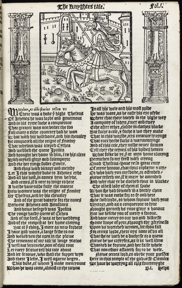
‘The Workes of Geffray Chaucer Newly Printed’ Geoffrey Chaucer London: R. Toy, [1550?] [S.L.] I [Chaucer – 1532] fol.We still showed a couple of early editions of Chaucer: his Workes from about 1550 (ESTC S122266), open at the ‘Knight’s Tale’ because that tale is rich in astrological symbolism, and the Workes from 1532 (the first complete edition of Chaucer) because it provides the earliest printed appearance of Chaucer’s Treatise of the Astrolabe. And we fetched out some other examples of medieval literature: a 1554 edition of Gower’s Confessio Amantis (in part imbued with astrology), and an illustrated edition of Dante’s Comedy from 1544, showing Dante’s paradise of nine concentric circles around the earth.
‘Philosophia Naturalis, Compendium Clarissimi Philosophi Pauli Veneti’ Paul of Venice Paris: J. Lambert, [ca. 1515?] M [Paulus] SRBut we also used early scientific works. Possibly the rarest item, and the item with the most illustrative appeal, is Philosophia Naturalis, by Paul of Venice (ca 1368-1428), printed in Paris in about 1515. Despite its comprehensive title, this book comprises just one work, De Compositione Mundi – an abbreviated Latin version of the thirteenth-century monk Ristoro d’Arezzo’s Composizione del Mondo, written in about 1282. The Composizione, itself based on work by Ptolemy, Aristotle, Averroes and others, is the first astronomical work to have been written in Italian; a further claim to fame is that it may have influenced Dante, who influenced Chaucer.
Visit the exhibition at Senate House Library (4th floor, Senate House), 29 June – 12 July 2015. Available during Senate House Library opening hours: Mon. – Fri. 9.00-17.45; Sat. 9.45-17.15.
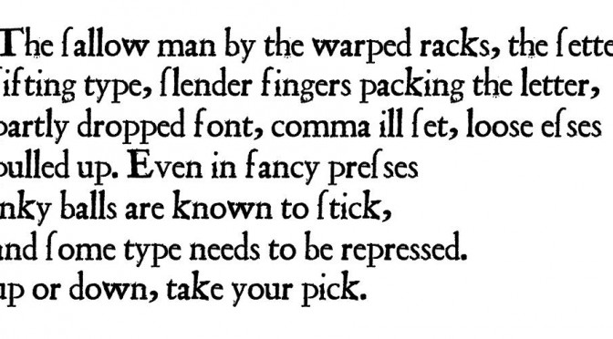
Last year I went to a conference on Error and Print Culture, where I was very taken with a certain type of early modern print error. If the type isn’t set tightly enough then, when it comes to inking, the sticky ink on the inking balls can pull a letter up out of the galleys and spill it onto the floor. And sometimes the hurried pressman, reinserting the letter without looking too closely at the context, might replace it upside-down by mistake. So what was supposed to be a u might appear as an n: the word love (or loue), for example, might become lone; or a p might become d (map becomes mad), and so on. Thus, Shakespeare editors face the challenge of deciding whether Othello casts his pearl away like the base Indean or the base Judean. So with my Oulipo head on, I wanted to see just how much of an editorial problem this might be: what would be the implications if we found ourselves in a state of radical doubt about the printers’ ability to get letters the right way up?
This was the plan: first I went online and found a dictionary – in this case a Shakespeare wordlist which runs to 20,000 or so items; then I wrote a computer program which takes each of these words and tries flipping its letters upside-down to see if you end up with another valid word from the same dictionary. You can set which flippable pairs you want to allow each time you run the program, but the options I coded for were p and d, b and q, u and n, a and e, and f and s (the long s shape in early printing can easily by mistaken for an f at the compositing stage). If you allow for all of these, you get a surprisingly large number of potentially ambiguous words: about 600 of them. A lot of them are only ambiguous within quite a narrow semantic field: Kentishman vs Kentishmen, for example. But some are more fun: fancy vs saucy, or the ultra-slippery pan, pen, peu, dan, den.
The last thing to do was to try to write something that used as many of these upside-down words as possible in order to be maximally ambiguous. Here’s what I’ve come up with so far: a pair of poems. They’re called ‘Sweat Themes’, after Spencer’s famous line (often incorrectly set as ‘Sweet Thames’), but also because there seems to be a lot of sweating going on in both of them.
Here’s one version. This one looks like it’s set in a print shop.But that is not what I meant at all! Here, of course, is the correct version:
This barely scratches the surface of the corpus of flippable words. What about pigs and digs; dies vs pies; the wise wife who’s weeping or possibly weeding because she’s dowerless or maybe powerless. There are fishy terms: carp (card), fin (sin), sole (sola), dace (pace), bass (bess), battered (bettered); boozy ones – fancy ales like becks become saucy, alas, like backs; and semantic leaps from common to proper nouns: orphans to orpheus; are you in denial or in daniel? For the radical doubter, even quite a straightforward document opens onto a world of instability, all Surrealist imagery and Modernist grammar. And all because of carelessness in the printshop: too-casual typesetting or getting too heavy-handed with the ink dabber. As Boney M so memorably meant to say, Oh, those ruffians!
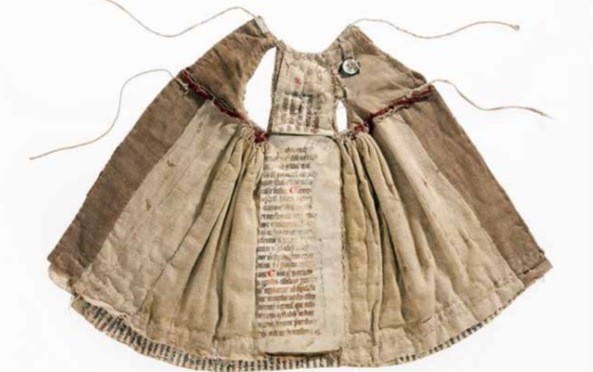
Image from: Charlotte Klack-Eitzen, Wiebke Haase and Tanja Weißgraf, Heilige Röcke, Kleider für Skulpturen in Kloster Wienhausen, Regensburg 2013.
One of the possible afterlives of a medieval manuscript, if it did not end up as part of the bindings of a new book, or as lighter paper for a fire, was to end up recycled in the lining of a dress, as a recent post to the Bodleian Library’s Conveyor notes. These parchment-dresses present themselves to us as objects from the past requiring explanation (though the explanations are sometimes more prosaic than we would hope). They also lend themselves to theorisation about the relationship between the categories ‘material’ and ‘textual’, as words detach from their original function and literally become material with which to clothe the body. A recent symposium organised by Sussex’s Centre for Early Modern and Medieval Studies on Modified Bodies and Prosthesis in Medieval and Early Modern England suggested that clothes—most strikingly early modern dresses shaped by stays and corsets—are bodily prostheses (Jenny Tiramani); but so too is clothing inscribed with words, such as parchment charms worn on the body (Margaret Healy). Words, like clothes, can shape and supplement bodies and selves. The medieval and early modern phenomena of textual clothing and material texts, however, are not left to us entirely without comment, nor entirely without theorisation in their own age. That is to say, people then, as now, made parchment-dresses do intellectual work.
There’s a medieval tale of a Parisian scholar who appeared after death to his former master, ‘clad all in parchment written, with small letters written thereon’.1 Unsurprisingly, the dead scholar’s appearance raises questions for the master, one of which concerns the significance of the parchment-dress, and the words written on it: ‘what meant that garment that was so light, & the letters that was written thereupon’. If these things require explanation, the master’s question assumes that at least one thing about this strange scene can be taken for granted: that the garment is ‘light’. He thinks he knows, from experience, the feel and weight of parchment. Logical deduction, however, is precisely what this tale is going to confound. The scholar explains that, in fact, each of the letters written on the parchment ‘are heavier unto me than were the weight of this great church’.
‘Saynt German’ (the Benedictine Abbey of Saint-Germain-de-Prés) in Paris.
The church in question is ‘Saynt German’ (the Benedictine Abbey of Saint-Germain-de-Prés) in Paris. The weight of this vast and lofty edifice is the measure of the words of ‘sophisms & subtelties’ with which the scholar had occupied his time in life. So heavy, and so hot, is this dress that the scholar cannot describe, only demonstrate what it is like: he asks his master to put out his hand, onto which falls a drop—of sweat? a word?— which is so hot (or so heavy) that it makes a hole in it. Bearing the hole in his hand for the rest of his life, the master subsequently leaves off logic and becomes a monk.
How much does a medieval cathedral weigh? How many letters are on the parchment-dress? What’s the sum of each letter multiplied by the weight of the cathedral of Saint-Germain? Scholastic wisdom holds ‘sophisms’ (questions used in disputation for logic) and ‘subtelties’ (an extreme refinement of argument) to be, by definition, light: The Middle English Dictionary defines ‘sotilte’, for example, as ‘thinness, slenderness, smallness’. But the scholar’s experience after death shows them to weigh heavy indeed: a single letter is like to the stone and timber and lead of a great gothic structure. Salisbury Cathedral, for instance, was built of seventy thousand tons of stone and over three thousand tons of timber for the roof, which was covered with four hundred and fifty tons of lead. You can do the maths.
In medieval thought, words—even subtle ones—are always material, as another medieval tale found in the same collection shows: if due care is not taken in letting blood, words, along with blood, might accidentally be emptied from the body (See pp. 336-37). What the tale of the Parisian scholar also suggests is that words—spoken or inscribed on parchment—shape and alter the self. In some ways, then, this exemplary tale literalises the medieval understanding that words are material, exerting influence on material forms as well as immaterial selves, accruing and accreting to supplement the body and the way in which it signifies.
The form in which the tale of the parchment-dress survives, however, in turn materialises what is increasingly understood to be the always already prosthetic relationship between books and bodies. The tale ends by relating that the master ‘became a good man; & as long as he lived there was a hole through his hand. Et c.’ There are more words, then, but these are not recorded on the page, and so they are (to us) absent, immaterial, unweighable. Of eight hundred tales, one hundred and fifty end with Et c. Elsewhere Et c follows a rubric, or occurs mid-sentence—for example: ‘And thus because he trespassed in flesh & would not eat flesh when his abbot bade them therefore he was punished in flesh-eating, et c, for his inobediance’ (p. 452). The Et c suggests—what? That the reader can supply the Et c? That there is a generic way of carrying on reading that means the words don’t need to be given in full? Several times ‘ad libitum’ follows the ‘et c’: that is, ‘according to pleasure’. As you please. Whatever you like. However we explain it, the Et c here points out that the relationship between material book and embodied reader is always a prosthetic one, imagination or memory or desire bridging the animate and inanimate, the human and the object. Like the parchment-dress, Et c merely literalizes this relationship and makes the injunction to supplement, to fill in gaps explicit. By the same turn, it also leaves quantifying and qualifying out of reach. The weight of words, the multiple ways in which we wear the books we read, must always, finally, elude us.
1An Alphabet of Tales: An English Fifteenth Century Translation of the Alphabetum Narrationum, ed. Mary Macleod Banks, 2 vols. EETS o.s. 126-27 (London: Kegan Paul, Trench, Trübner, 1904-05), pp. 104-05. I have modernised the orthography.
Several times a year, Senate House Library provides small displays to support academic conferences. The Library demonstrates thereby that the items in its special collections, far from being museum pieces, are relevant for research. Conference delegates are able tangibly to see some of the items talked about and items of related interest, as well as realising the availability of resources that they can return to consult later on.
100 Dubliners, celebrating the centenary of the publication of James Joyce’s first book of fiction, presented a certain challenge on the display front. Displays rely on attractive exhibits, and James Joyce’s Dubliners (1914) is not, in its first edition, an attractive book – in fact,
James Joyce, ‘Dubliners’ (London, Richards, 1914); cover.
it is a rather drab one. Yet it had to be the centrepiece of any display based on Dubliners, and perhaps the very drabness, from the point of view of the materiality of the book, is useful in demonstrating the modest beginnings of a book which was to become a landmark in the history of literary modernism, of Irish literature, and of the short story form, but which had a long and rocky pre-publication history.
James Joyce, ‘Dubliners’ (London: Richards, 1914); title page.
Drabness, indeed, was nothing unusual, as is clear from the display of two roughly contemporaneous books which are better looking only in having their title pages in red and black. George Moore’s The Untilled Field (1903) is considered by some to be the progenitor of the Irish short story, and credited as an influence on Dubliners. And W.B. Yeats’s Poems, 1899-1905 (1906) was chosen for display because of Yeats’s friendship with and influence on James Joyce, and for reference within Dubliners to the Celtic Twilight.
The first edition of Joyce’s Finnegans Wake (1939) was selected for display on the basis of its oblique reference to the alleged burning of an edition of Dubliners by its Dublin publisher in 1912. The Wake is not much prettier than the earlier volumes, but it does reflect the status of a by now established writer. The copy is one of an edition limited to 425 numbered copies, signed by the author, and the margins are unusually large: 4 cm for the outer margin, and 6 for the bottom margin (5.5 cm below the page number).
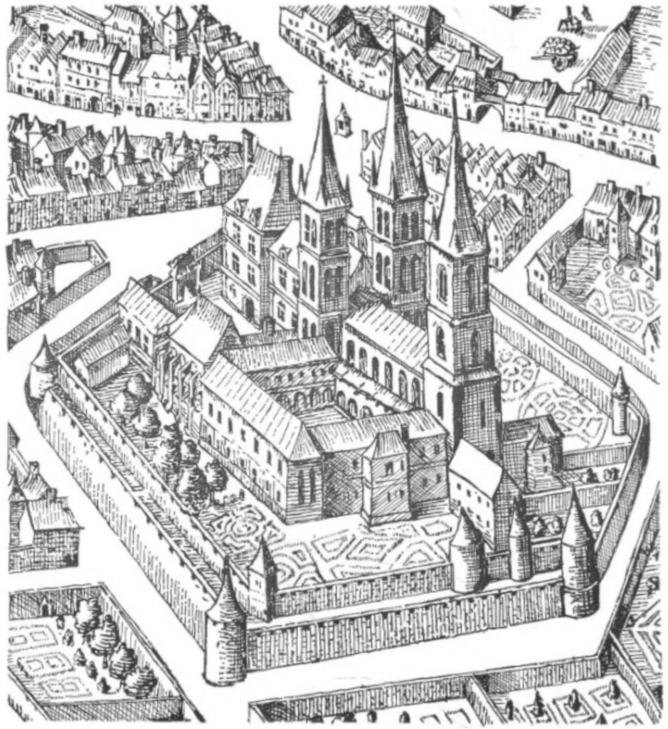
‘Hanna & Neale’s New Large-Scale Plan of Dublin’
Unappreciated in the years leading up to 1914, Dubliners had become well and truly canonised by the time the Dolmen Press brought out its edition in 1986, illustrated by Dublin-born painter Louis le Brocquy. Visually, it would be the drawing point of the display, were it not for Hanna & Neale’s New Large-Scale Plan of Dublin, showing Dublin as it was about one hundred years ago. Joyce, incidentally, frequented their bookshop …
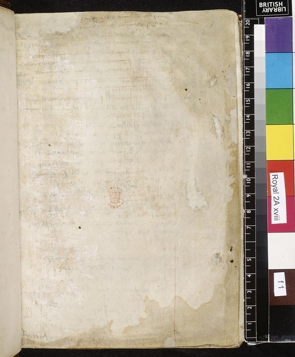
The page above seems unremarkable: devoid of textual content, described as “blank” in the accompanying British Library description, it appears to have been written only by the unguided hands of time and decay. The stains and other marks attest to the use of this parchment folio as a flyleaf, the first of two at the start of a fifteenth-century manuscript. Flyleaves were often left at the beginning and end of a manuscript to protect the rest of the text from damage; while many remain blank, others became a prime location for ownership inscriptions, rough drawings, and other doodles (manuscript scholar Erik Kwakkel has recently blogged about flyleaves here).
At some point in this folio’s early history it was prepared for text; rulings for a text block in red crayon are faintly visible at the top of the folio and towards the bottom right corner. While this text block remains unfilled, the writing on the verso side of the folio shows through on the recto, its spectral presence emphasising the enduring absence of text on this side of the folio. More recently, a British Museum stamp has been added close to the centre of the page, a mark of the manuscript’s final resting place and, by extension, its incorporation into modern schemes of foliation, description and cataloguing. Despite its designation as “blank” in the online catalogue then, it would seem that there are still things to say about pages like that of fol.1r of British Library, Royal MS 2A xviii.
“Ecological Remainders”
The page above has been something of a departure point for work I have been doing recently on the blankness of medieval writing surfaces, particularly in fifteenth-century English manuscripts. While it is not uncommon for manuscripts to include “blank” leaves, I have come to think that what such leaves show is that the space of manuscripts is not, in fact, absolutely blank, at least not in the sense that that word has come predominantly to occupy. That is, the blankness of medieval manuscripts is of a different order to the chemically-induced whiteness of a modern sheet of A4 paper, or the pristine virtual whiteness of a word processing document on a computer screen.
As well as tracing the etymology of “blank” and its overlap with “white” then, I have been considering just how blank the leaves of manuscripts really are. The parchment and paper used in fourteenth and fifteenth-century manuscripts preserve numerous instances of what Joshua Calhoun has recently called “ecological remainders” (“The Word Made Flax”, PMLA vol.126 no.3). Calhoun’s focus is on sixteenth and seventeenth-century printed Bibles, but the manuscripts of the fourteenth and fifteenth century arguably provide an even richer record of the ways in which the page might reappear as something more than the unmarked substrate of inscription. The labour-intensive, time-consuming practices required to produce medieval folios resulted not in pristinely white pages, but rather multihued surfaces that, before the addition of any textual content or evidence of their passage between scribes and future readers, preserved the memory of their previous existence as animal skin or plant matter.
To produce parchment, skins were washed, soaked in lime (calcium oxide, obtained by heating limestone and combining the remnants with water), washed a second time, dried under tension, and then de-haired. The occurrence of scar tissue or holes in the page as a result of pre-existing injuries to the animal often required scribes to curve or separate their writing. Such holes could also be the result of parchment makers pushing too hard with their tools while removing hair, a reminder of the labour-intensive processes required to turn animal skin into a surface receptive of crayon, ink and gold leaf.
On fol.7r of Oxford, Bodleian Library, MS Rawlinson D. 101, a manuscript of travel narrative The Book of Sir John Mandeville, a hole equivalent in height to around three and a half lines of writing has been incorporated into the scribe’s copying of the text. On fol.7v though, the scribe was forced to split the word ‘relykes’ [relics] around this hole in the page, ‘re’ on the left side and ‘lykes’ on the right. This flaw in the page results in a fortuitous yet apposite combination of text and manuscript materiality: in a section of the Book of Mandeville that ironically details the multiplicity and brokenness of medieval relics and the competing claims of veracity attendant on them, the word ‘relics’ has itself been cleaved in two.
Medieval paper was made from cellulose; flax, commonly in the form of linen, was obtained as cloth rags. Linen was itself difficult and time-consuming to prepare: before the process of spinning could begin, the flax was rhetted (soaked in water or dew in order to separate the fibre from the stalk); broken (beaten with wooden mallets); and then drawn through a hackle (a device resembling a bed of nails). Before it could become a writing surface, linen had already undergone a lengthy process of production and an even lengthier period of inhabitation or use.
To make paper, the collected cloth rags were fermented in vats for six to eight weeks, in order to weaken the fibres. This material was then beaten to a pulp before being cleaned. A screen tray papermould constructed of vertical and horizontal wires (chain-lines and laid-lines respectively) was then covered in a layer of pulp; this wire screen at the bottom of the mould retained the pulp but enabled excess water to pass through. A removable rim known as a deckle set the size of the sheet. Once set, the sheet was added to a pile and then pressed to remove as much remaining water as possible. After repeated stacking and drying, the sheets would be coated in size, a substance made from boiled fragments of parchment and leather.
The slightly brown or yellow hue of many paper folios is evidence not of the discolouration of a whiter original condition over time, but rather of the retention of these colours from the process of production itself: the paper produced at mills alongside particularly muddy rivers, or during the wet spring months, would preserve this fact in their hue. Further, on occasion fragments of organic matter that had made it through the paperman’s vat and mould resurface in the page; small knots of flax or single hairs can be found in medieval and early modern paper books.
The use of fragments of parchment to produce size is one instance of what might be thought of as the circling or looping nature of the ecology of textual production and consumption from the medieval into the early modern age. Just as fragments of parchment might be recycled in a variety of ways, paper was only one form flax could take in an extended series of use and reuse: flax became clothing or canvas which, when worn out, might then be used to produce paper. In turn, books might be read to rags, which could be added again to the vat to produce new paper, or could be further broken down and used as fertiliser for growing more flax plants.
Blank leaves & blank spaces
Even without text then, the leaves of manuscripts are legible in a certain sense. Once a medieval scribe had added text to these leaves though, it was not uncommon for them still to include “blank” (i.e unwritten) spaces. Manuscript digitisation projects have tended, initially at least, to focus on illuminated pages that are well planned and laid out, richly arrayed, and complete. However, for all such pages, many more survive that are somehow incomplete or fragmentary. In an oft-quoted passage, manuscript scholar Ralph Hanna argues that vernacular manuscripts should primarily be thought of as ‘fluid and developing entities’; rarely planned in advance, their contents often contingent on the availability of exemplars for scribes to copy, these manuscripts frequently contain blank spaces between, and even within, texts. In this context, blankness in manuscripts seems always to be a potential space for further writing. Opening the manuscript to the future, blank leaves and spaces are potential points of transition in a manuscript’s evolving history.
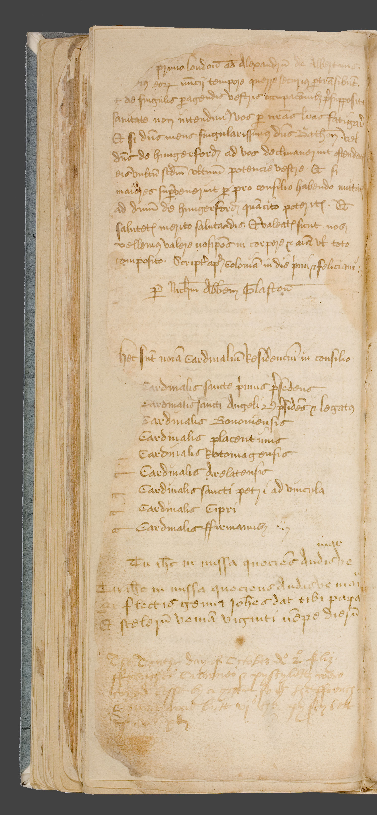
The “Glastonbury Miscellany” is a particularly good example of a manuscript in which blank spaces became the site of further additions. These additions traverse the “great divide” between medieval and early modern periods; while taking the manuscript far from its original context of production, they attest to the ways in which tracing the lived existence of manuscripts might enable the broader project of rethinking periodization. Work began on the manuscript in the middle of the fifteenth century, with the Miscellany originally intended to be an account book for Glastonbury abbey: fol.1v includes a list of accounts, now largely illegible due to water damage sustained in the second half of the sixteenth century. This purpose appears to have soon changed as a number of more literary texts were added, including many that relate to the abbey’s abbots and monks, as well as its legendary founder Joseph of Arimethea.
During the Reformation in the sixteenth century, Glastonbury abbey and the Glastonbury Miscellany experienced differing fortunes. On the orders of Thomas Cromwell, the abbey was visited by agents Richard Layton, Richard Pollard, and Thomas Moyle in September 1539. Stripped of its valuables and its abbot Richard Whyting brutally executed as a traitor in November of that year, Glastonbury abbey began its slow decline: masonry was removed from the abandoned buildings as they passed between private owners and by the first decades of the eighteenth century the site was already being described as a ruin. Around forty manuscripts survived the breaking up of the abbey’s library though, including the manuscript now know as the Glastonbury Miscellany.
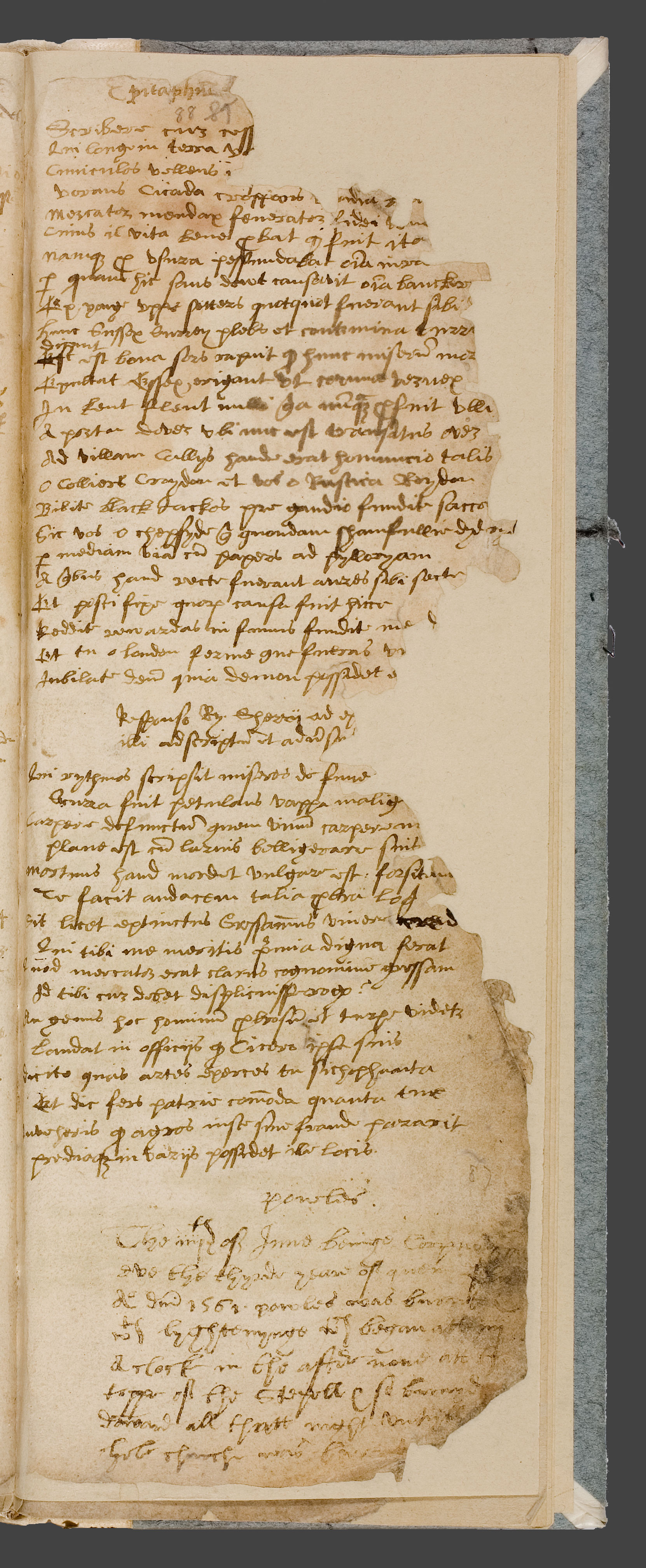
As the place of its production and the impetus for so much of its original contents began to crumble, the Glastonbury Miscellany itself continued to invite further additions and emendations. The Miscellany was still being added to in the 1560s, both in the spaces between and alongside those texts originally copied and, most extensively, in a number of folios later in the manuscript that remained blank after the efforts of the original scribe in the fifteenth century. One later reader in particular was responsible for much of the additional material incorporated into the manuscript in the decades after its removal from the abbey, adding seventeen further items of varying lengths, including (but not limited to) an acrostic poem, proverbial verses, and a short verse on the symbolism of colours.
The last datable entry by this later reader was on the fourth of June 1561, a short note on a fire at St Paul’s Cathedral squeezed into a small space at the foot of fol.88r. The text above the note on St. Paul’s is a topical verse in two sections in the same hand. The first verse is an attack on Sir Richard Gresham, a mercer and former sheriff, alderman, and mayor of London and Member of Parliament who died in 1549. The second verse is a reply by author and schoolteacher Richard Sherry. These additions suggest a new urban environment for the manuscript: transferred to London, the manuscript had apparently become part of a new network of reading and use through which urban events and the fallout of political manoeuvrings co-exist alongside the monastic setting of the manuscript’s original composition.
A short note (headed ‘Powles’) on the burning of St. Paul’s, London, in June 1561, beneath two topical verses on former mayor of London Sir Richard Gresham. Trinity College, Cambridge, MS O.9.38, fol.88r. Image via Scriptorium: Medieval and Early Modern Manuscripts Online
On other pages the earlier monastic and later urban locales occupy the same space. On fol.79v a note on English and French currency, specifically dated to ‘The Tenthe day of October Ao 2o Eliz[abeth]’ has been copied by the later reader/scribe in a small space at the foot of the page. This note has been squeezed into a space beneath a reproduction of a letter by Nicholas Frome, Abbot of Glastonbury from 1420 to 1456 and a short prayer, both copied by the original scribe in the fifteenth century. While this letter occupies a greater proportion of page, the later note gets the last word on the folio, both sequentially and temporally.
A note on English and French currency beneath a reproduction of a letter by Nicholas Frome, Abbot of Glastonbury from 1420 to 1456 and a short prayer. Trinity College, Cambridge, MS O.9.38, fol.79v. Image via Scriptorium: Medieval and Early Modern Manuscripts Online
Attesting to the inevitability of the future, these varied additions became part of the manuscript’s evolving contents. It would be overly simplistic though to read these later additions as a symbol of a monastic, inward-looking Middle Ages yielding to an increasingly urban(e) early modern world. Though predominantly focusing on the immediate context of the manuscript’s production, the original scribe did include a small number of texts concerned with detailing urban locales, including The Stores of the City, a description of seven English cities beginning with London that mixes Latin and Middle English. In turn, the later readers did not only add new texts in the blank leaves and spaces, but also historicised those texts copied by the original scribe, adding marginal comments in the form of proverbs and other notes and titles and attributions of authorship where they were absent. While the numerous later additions attest to the openness of blank leaves to further writing, these notes and titles attest to a simultaneous desire on the part of the manuscript’s sixteenth-century readers to interact with and codify its earlier contents. Far from simply attempting to wrench the manuscript from its original context of production, its later readers seem to have been conscious of their position writing in the pages of a manuscript of such varied content, caught in the midst of a recent past and an uncertain future.
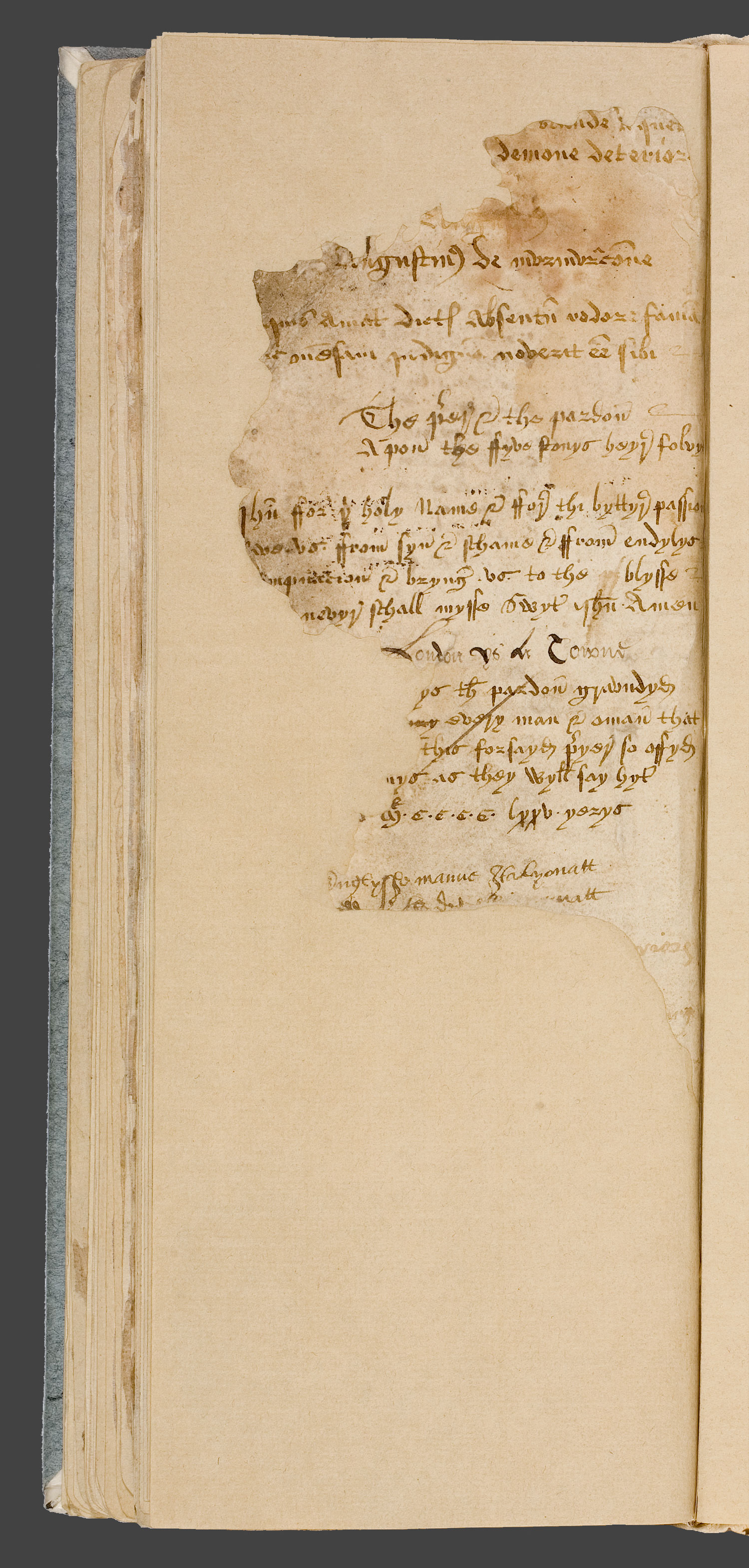
I would like to close by briefly noting a form of blank space in the manuscript as it now survives that (in all likelihood) will not be the location for any further writing: those blank leaves added to the manuscript more recently to ameliorate the damage it sustained in the second half of the sixteenth century and at later points in its history. This damage makes it difficult to reconstruct the exact sequence of additions made by the numerous hands that followed the original scribe in the pages of the manuscript. It is unclear how many other texts have been lost, texts that may have given us an even fuller understanding of the interactions, contrasts and tensions between the manuscript’s original contents and those later additions in the inviting blank spaces that remained after its initial production phase. For all the Glastonbury Miscellany tells us about how medieval manuscripts continued to be read and added to in the fifteenth and sixteenth centuries, the blankness of those modern leaves on which particularly badly damaged folios have been mounted during its restoration is a small reminder of all that we have lost from our period of study.
Trinity College, Cambridge, MS O.9.38, fol.89v. Image via Scriptorium: Medieval and Early Modern Manuscripts Online
Yesterday, under the #bookadayuk hashtag, Twitterers were invited to name a book they’d started but never finished. For me, I barely know where to begin with this question. Many, many books I read for pleasure get interrupted by books I read for work, and so on. But it did make me think about books which other people started but didn’t finish, and more specifically about the bookmarks we often find in secondhand books, which tell us how far the previous owner got before they gave up, or before something interrupted their reading and they never came back.
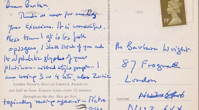
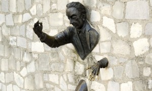
Last summer I was browsing in the boxes outside Collinge & Clark (the secondhand bookshop that was the model for Black Books) when I came across Marcel Aymé’s Les Contes du chat perché. Aymé is someone I’d been meaning to try for a while – he’s probably best known in this country as the writer whose Man who Walked through Walls is commemorated by a statue in Montmarte – and this book looked pleasingly duffed-up in its yellowing Gallimard covers. Picking it up and leafing through, the pages fell open at a particular place, and there inside was a postcard addressed to Mrs Barbara Wright of Frognal, London.
This was quite a surprise: Wright’s was a name I knew very well. One of the great translators of the French avant-garde, she was someone I admired immensely. She had also been the best friend of Stanley Chapman, for a long time the only English member of the Oulipo, whom I had known towards the end of his life. To make things even stranger, I had just that week written a review of her reissued masterpiece – the English translation of Raymond Queneau’s Exercices de style.
All in all then quite a coincidence. But other things struck me too. Firstly, the postcard-as-placeholder, jammed in at page 56: it was heartening to think that even such an estimable reader as Wright sometimes didn’t get any further.
Then there’s the things we use as bookmarks. From a quick straw poll among my colleagues, only one of them ever uses an actual bookmark, something purchased for the express purpose of keeping their page. Most of us, I think, use whatever we have to hand, or in our pockets: bus tickets, leaflets, postcards. We keep books for life, but they act then as time machines for the everyday materials we use to hold our place. Most of the time we only want a bookmark to keep our page till the next read – the tube ride home; bedtime tomorrow – but when we abandon a book, these ephemera get caught up in a different order of time, like mayflies frozen in amber.
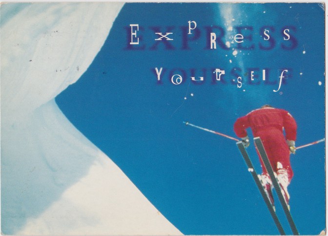
I love the naffness of my Barbara Wright postcard with its skier and its “expressively” idiosyncratic typography. It’s so identifiably 1980s, smuggled into the twenty-first century between Gallimard’s resolutely anti-periodic covers. And yet the message on the card, written in a variety of codes, aping the methods of Exercices de style, bemoans the latest strike on the métro: even on bookmarks, some things are timeless.
As part of Birkbeck’s annual Arts Week programme, Dr Isabel Davis an Dr Gill Partington gave a pair of public talks, one on man-eating books, the other on book-eating men. Podcasts of both can be found here.
 discover that Birkbeck houses a small collection of not one but four medieval books (three manuscripts and one incunabulum). I quickly arranged to view the books, three of which have not been catalogued and do not seem to have been viewed since around 1991. The books comprise a sort of ‘capsule collection’: they represent several important developments in European religious culture, in book history, and in literary tastes.
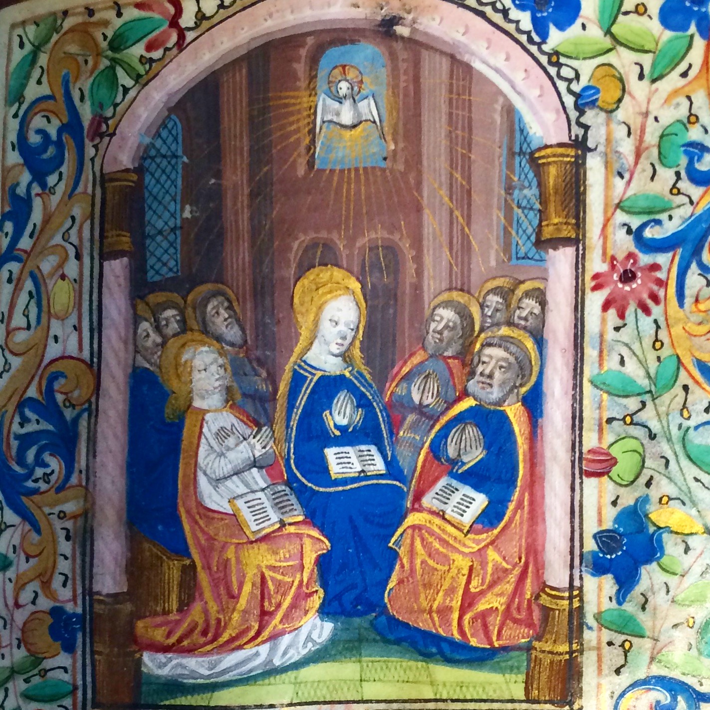

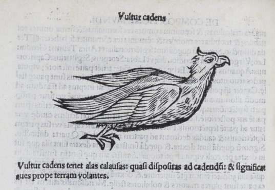
!['Philosophia Naturalis, Compendium Clarissimi Philosophi Pauli Veneti' Paul of Venice Paris: J. Lambert, [ca. 1515?] M [Paulus] SR](http://www.materialtexts.bbk.ac.uk/wp-content/uploads/2015/06/Chaucer-exhib-2015-Paulus-Venetus1.jpg)


 ymé is someone I’d been meaning to try for a while – he’s probably best known in this country as the writer whose Man who Walked through Walls is commemorated by a statue in Montmarte – and this book looked pleasingly duffed-up in its yellowing Gallimard covers. Picking it up and leafing through, the pages fell open at a particular place, and there inside was a postcard addressed to Mrs Barbara Wright of Frognal, London.